You're Broke bc Your Brand Probably Sucks & How to Change It
Oooooh, harsh. I see tons of sucky brands out there. Forgettable names (but that's not you, now is it?) and boring colors and ho-hum logos.
And even WORSE websites. (That not only look bad but also don't convert.)
If only everyone had my taste level (lol and right now my site has some HORRIFIC things I need to change).
Sadly, they don't have my taste level.
And I feel like it gets harder and harder to find designers who are a. easy to work with and b. talented.
Add to this conundrum the fact that a good logo designer is not typically a good web designer and then stir in the fast-moving pace of developments in the web world along with the notoriously flaky nature of many a web-ster and you've got a recipe for a headache and skyrocketing costs.
Sites like 99Designs and elance have somewhat eased the pain, but sometimes they just compound it.
Just writing about the situation makes me cringe.
So what's a busy business owner to do?
Well, dear, take my hand and don't let go. We're about to go on a magic carpet ride in the world of branding.
Wheeeeeee!
When we drop into this world, the first thing is that we are mesmerized by the colors! The shapes! The possibilities! So many options and so many designers!
First things first: you may or may NOT need a logo. Take a deep breath, my business-building friend, because all is not as it seems in the world of branding and visuals.
I like logos that are symbols.
After all, if you were to see the Nike swoosh at the end of a long hallway you would know exactly what business it stood for (and their tag line). That is beyond brilliant branding. When facebook first started, we didn't know that the facebook "f" would become synonymous with the social networking site. Ditto for twitter and both their "t" and bird.
But unless you are trying to create a truly global brand with a distinctive logo that transcends language, I wouldn't spend too much time or money on it.
Instead, I'd find a designer to create a lovely typography logo.
What is this, you ask?
Well, it's simple.
You take your phatty mcphats business name that you've created and you and your designer tries the name out using tons of different fonts. If you have a savvy designer (and you should) then he/she is going to offer you some things you may never have thought of.
A crash course on fonts:

Sans serif means type faces that don't have the little "squigglies" on each letter. Arial and Helvetica are standard sans serifs.
Serif fonts are the opposite. They do have squigglies. Times New Roman and Georgia are classic serifs.
In general, sans serifs look clean and modern while serif fonts indicate richness or quality or seriousness.
Try out your typography logo in a whole heap of serif and sans serif fonts. Look in the appendix for where to do this. It's super fun. People use the same font tool for trying out tattoo fonts too. I love the internets.
You'll probably be drawn to a couple fonts. Seeing your business name in fonts (and in lights!) is really exciting and can help drive the direction of your actual site and the rest of your branding.
Logo Design

If you insist on a logo to go with your brand (and some of you will need one), you need to keep a few things in mind:
1. If you're on a budget, go with a site like 99designs. It's fast, quick and easy. 2. Make sure that your logo does not look too much like a national or global brand's logo. 3. Find some logos that appeal to you, even if they are not in your market niche and be able to tell your designer why you like them. 4. Know that logo design (with the right designer) should not take umpteen revisions. 5. If your designer tries to sell you on how his process is so complex and looks at demographics, etc, know that he's way too concerned about justifying his high priced graphic design education and keep looking. 6. If your designer goes to bat overzealously for his favorite logo or offers you logos that explicitly ignore your brief, then politely decline to continue working with him. You are the client, and even if he does have a whole bunch of thought process around why he chose that particular shade of green, it's not worth it if he doesn't listen to you. 7. If your designer sends black and white mock ups to you as part of the process, that can be difficult for you to picture in a more refined form. I tend to shy away from designers who use that as part of their process unless I have a really obscure brief and lack direction. Then it can be nice to use doodle drawings to figure out which way to go visually.
Color Palette
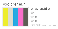
 Color by COLOURlovers
Ok, now that you've got your typography logo and your font, it's time to do color palette!
You can educate yourself on color. Again, check out the resources in the appendix. I love ColourLovers and there is a great video about color theory.
Here's my simplistic view of colors and their immediate/popular meanings/associated feelings:
Blue: Rich, water, clean Green: money, natural, environment Red: passionate, blood, love Pink: feminine, soft, compassionate Black: luxury, modern, dark Orange: friendly, caution, gender neutral Yellow: happy, Grey: neutral, clean, techy Brown: depth, natural, Purple: feminine, spiritual, rich
Choosing your color palette is ideal
BTWS:
On finding a designer:
Good designers are hard to find. I hate to affirm that, but I have watched tons of my clients try to go the easy/cheaper route only to be frustrated in the end. A brilliant designer asks questions, listens intently to the client, mirrors the way the client works and observes how the client makes decisions. A brilliant designer is gifted with more than one visual "style" though he or she might have a signature look. A brilliant designer takes a client's brief, integrates it into the designs he sends back in the first iterations as well as offers departures from the brief that the client might not have in her visual language.
Ideally, there will be one or two particular designs that stand out immediately to the client and the designer can go back to refine those more.
I have a few resources and share those in the appendix.
1. In general, look at a designer's work. Most of them are one trick ponies. They are good at one style/vibe of design and that's it. If it jives with what you want, then go for it!
If you think that you're going to get something different out of someone after looking through the portfolio, you will be disappointed.
2. Once you find a good designer, keep him/her.
3. Contact the designers of sites/logos you see online and like. Do not cringe when you hear their prices. In most cases, it's worth it.
4. Avoid design firms in general. Their markup is usually so high that you end up paying 3x what you'd pay an indie. Plus, they usually don't do what you tell them to do because they're so caught up in the aesthetics. Now, aesthetics are important, but so is conversion.
5. Use these guidelines for pricing.
Typography logo: $200 to $800 Icon logo: $500 to $2000 Business card design: $250 to $750 (A note on biz cards: I spend a lot on both design and printing for my biz cards. And it's worth it. Yeah, I have thousands of the things but every single time I hand out a biz card, I receive a compliment. And that person remembers me and my card. Guess what, that's marketing. And it's cheap.) Web sites: $1500 to $4000
You most often get what you pay for, though there are exceptions. I know a well-regarded web designer who makes $4000 to $6000 for a site but who hasn't changed his approach to design in years. The result? His clients receive ok-looking sites that have no relevance in the rapidly changing internet economy.
Sad. Sniff. Stupid.
You MUST educate yourself on what works or you risk losing money, time and clients as a result.
Next up: a killer tag line.

